Pacing Charts

Factory Scene’s Pacing Chart

Factory Scene’s Pacing Chart

Pacing chart Overview:

Much like a runner knows the pace to achieve a race goal, a manufacturing pacing chart provides the timeline to achieving the production goals. It is a visual representation of schedules and results that allow the viewer to see how they have progressed, what they are currently working on and what is up next.

Pacing Chart Features:

The pacing chart in Factory Scene provides a clear visual representation for employees and plant management to see what work is currently being done, the upcoming schedule at a work center and understand the success and issues with past work. Additionally, immediate access to work instructions is provided on-screen so employees can click to view the steps to complete each unit of production.

Control Charts

Factory Scene’s Control Chart

Factory Scene’s Control Chart

Control chart Overview:

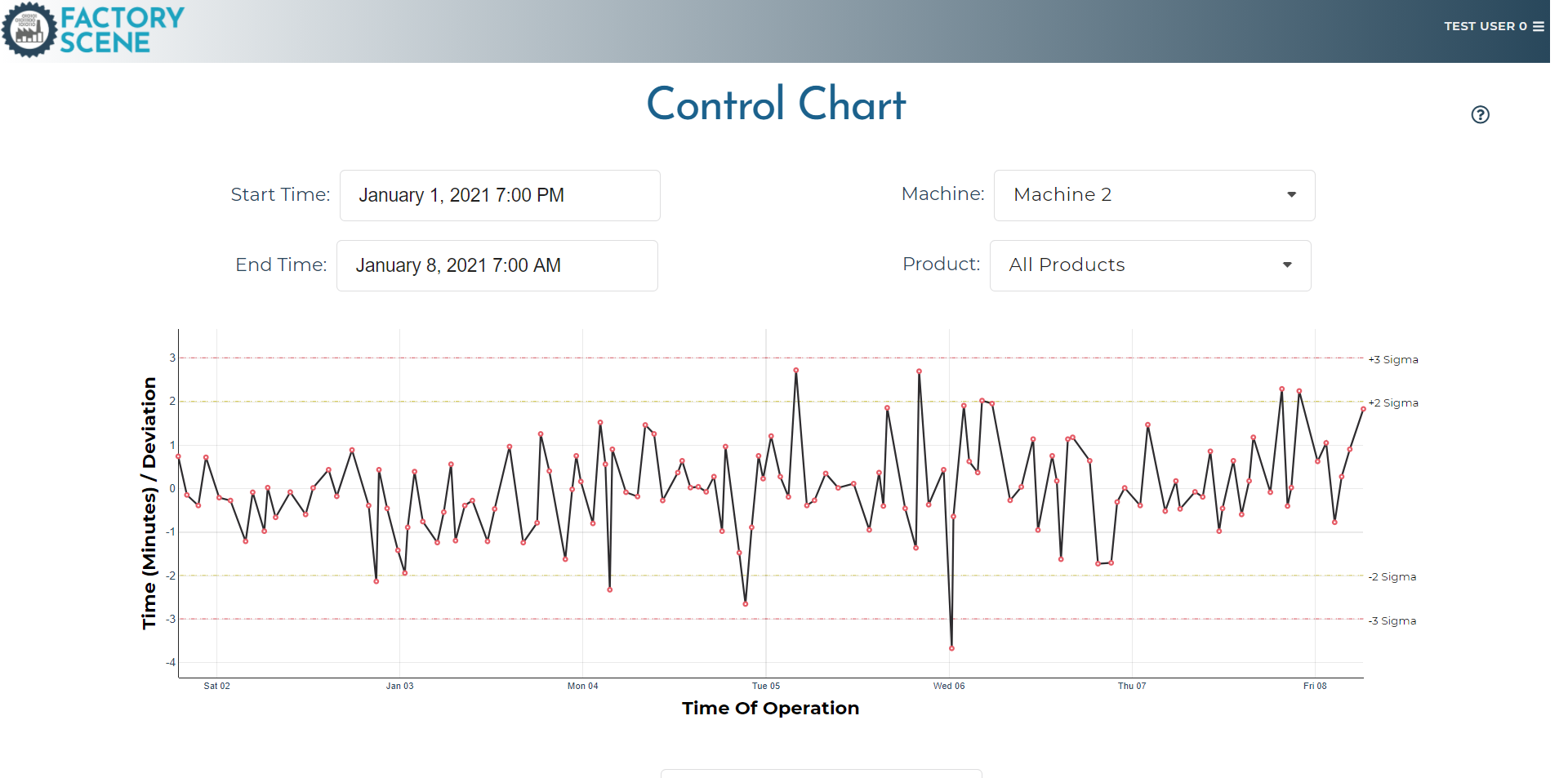
Statistical Process Control (SPC) charts have been a fixture in manufacturing plants for decades. They provide a simple, easy to understand way to determine if a process is in control (both precise and accurate). It is a time tested tool to reduce variability and improve both quality and productivity.

Control Chart Features:

The control chart in Factory Scene works as any other control chart would, pulling in production data and highlighting when processes appear to be out of control parameters (typically +/- 3 sigma). It can be sorted by Work Center, Product and Time to better pinpoint when a process might be deviating. It also includes the option to convert to a normalized data version which takes into account varying production time standards when many different products are produced on the same machine.

Pareto Charts

Factory Scene’s Pareto Chart

Factory Scene’s Pareto Chart

Pareto chart Overview:

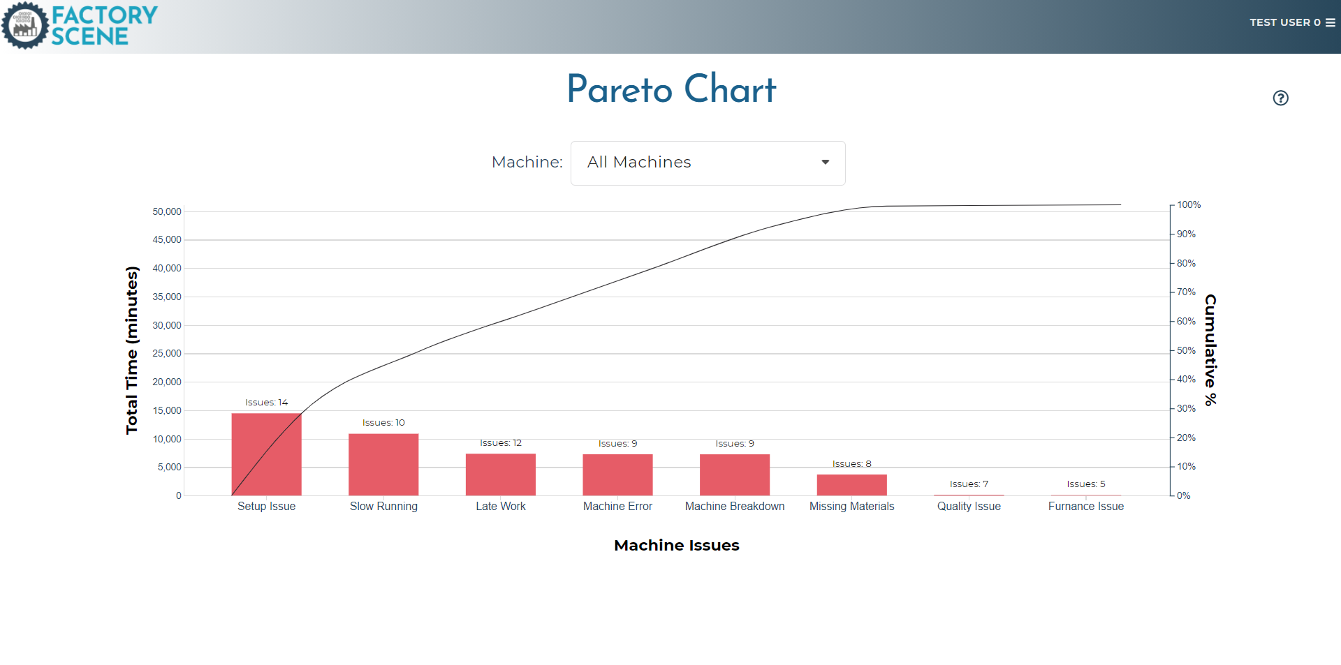
The Pareto chart is another time tested tool for diagnosing quality issue and production problems. It groups all related production issues together and graphs them in order of severity and time lost, highlighting the most pressing issues at a machine or factory.

Pareto chart Features:

The Pareto chart in Factory Scene collects all issues identified during production and groups them by amount of time lost in the production process. It orders those issues so the viewer can easily identify the most costly in terms of time lost. It can also be sorted by Work Center to understand if an issue is localized or is a factory wide problem. The additional line graph highlights what percent of time the cumulative problems amount to for the work center or factory and helps a user apply the 80/20 rule when diagnosing problems.

Overall Equipment Effectiveness (OEE) Chart

Factory Scene’s Overall Equipment Effectiveness Chart (OEE Chart)

Factory Scene’s Overall Equipment Effectiveness Chart (OEE Chart)

OEE Chart Overview:

An Overall Equipment Effectiveness (also known as OEE) chart works to breakdown lost production time into sources. Specifically it highlights lost downtime, lost performance time and quality losses - all losses that contribute to less than optimal operations. The chart helps managers see the broad categories for production losses.

Overall equipment effectiveness (oee) Chart Features:

The OEE chart in Factory Scene highlights all downtime that leads to production loss and any quality issues that lead to lost time. It is able to pull out performance (or speed losses) when production maybe be operating but at a slower than normal pace. Work Center and Time can be selected to better pin point the source of lost production time or it can provide an excellent overall view for sources of waste across the factory floor.

Standards Histogram

Factory Scene’s Standards Histogram

Factory Scene’s Standards Histogram

Standards Histogram Overview:

A standards histogram chart counts the number of times production falls into a certain time interval. By displaying a distribution showing those counts and time intervals, it helps plant managers and employees see variability in production times within the same products or machine.

Standards histogram Features:

The standards histogram in Factory Scene allows a user to see the distribution of times that each product takes to produce and helps guide employees and plant manager to identify outliers. It can be filtered by Time, Product and Work Center to pinpoint where issues arise and what corrective actions might have the most impact.

See What Factory Scene Can Do For You: